Improving Marketplace Conversion and Discovery
Improving Marketplace Conversion and Discovery
Overview
As Carry1st scaled across markets, the Shop experience began to show cracks. Users struggled to find products, trust signals were inconsistent, and rigid back-office tools slowed down internal teams. We ran a research-driven UX refresh, tested with users and shipped in phases to unlock growth across markets.
Categories
Marketplace
Consumer
Data-Driven Design
Back-Office & Internal Tools
Team
3x Product Designers, 2x Product Manager, 5x Engineers, 2x Growth Team, 1x Operations Team, 1x Customer Support Team
Timeline
12 Weeks(Discovery to end-to-end UX refresh and rollout)
Platform
Mobile (IOS and Android), Web
My Role
UX strategy, User research & interviews, Product redesign, Back-office UX, Design system, User validation & testing

4.4×
Monthly Active Customers Growth
58%
Increase in first-time purchase conversion
45%
Reduction in early-funnel drop-off
The Problem I Observed
Over a 6-month period in 2024, the Carry1st Shop served tens of thousands of customers, but scaling exposed major UX gaps:
32% of users dropped off within the first two screens
41% of new users never reached a product page
1 in 3 shoppers didn’t know rewards or promos existed
Inconsistent UI across shop, emails, payments, and promos hurt trust
During peak traffic, conversion dipped by up to 22%
Behind the scenes, outdated back-office tools made simple updates slow and expensive, blocking growth and experimentation.

The Goal
Create a clear, trustworthy, and scalable shop experience that:
Improves discovery and conversion
Designed to scale across markets with region-specific personalization
Enables Growth, Ops, and CS teams to move fast without engineering bottlenecks

What I did
I worked within a 3-person design team worked on the shop and the new design system. Also led and solely handled the back-office configurations.
Competitor benchmarking (regional + global gaming commerce)
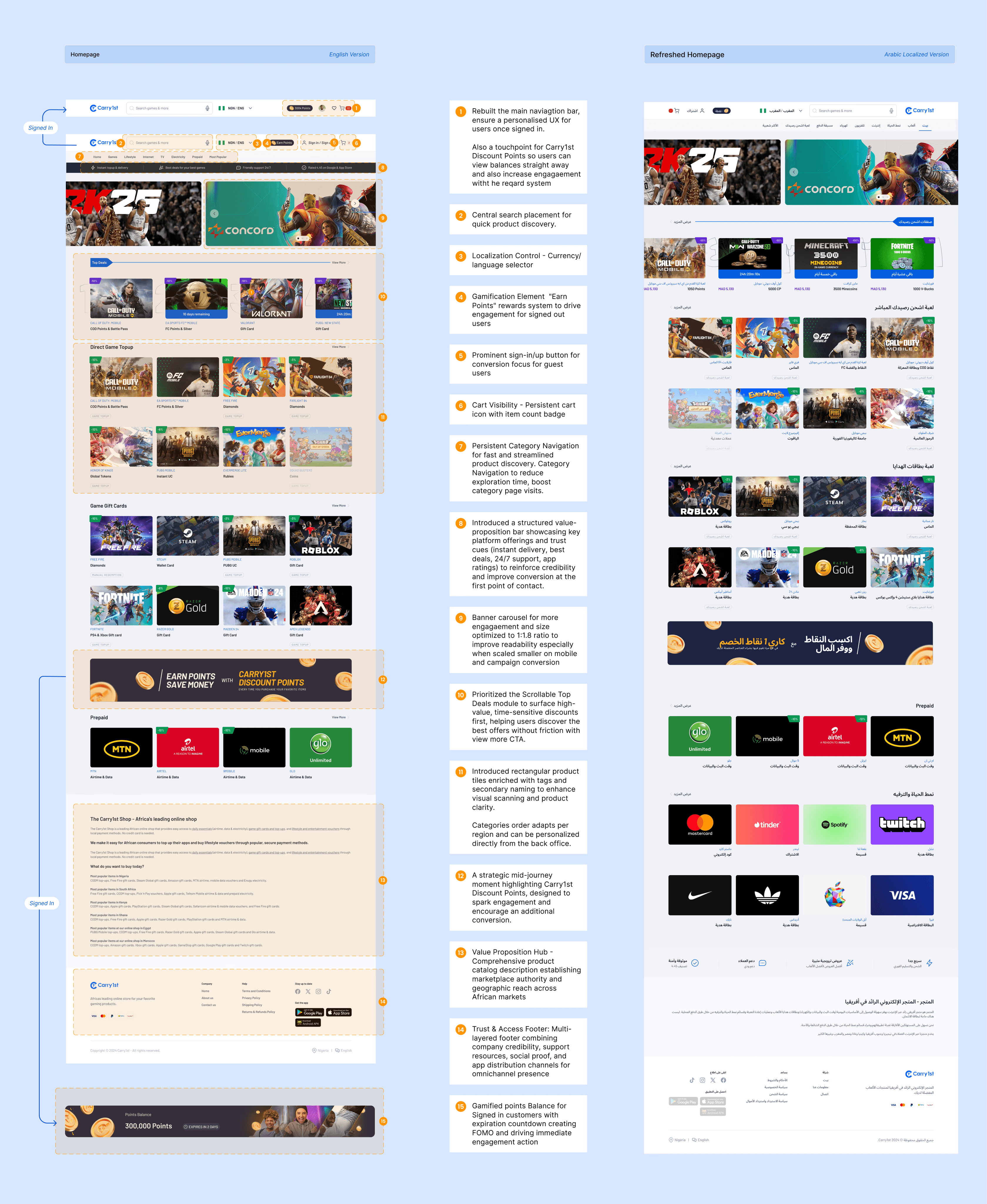
Redesigning homepage, Product pages, navigation and onboarding
Redesigning homepage, Product pages, navigation and onboarding
Running 50+ user interviews and a 126-response survey
Analyzing funnels, support tickets, and behavior data
Analyzing funnels, support tickets, and behavior data
Facilitating cross-functional workshops (Growth, Ops, Engineering)
Rebuilding and unifying the design token system across platforms
Partnering closely with engineering on specs, edge cases, and rollout
Leading admin/back-office UX to support the new shop experience


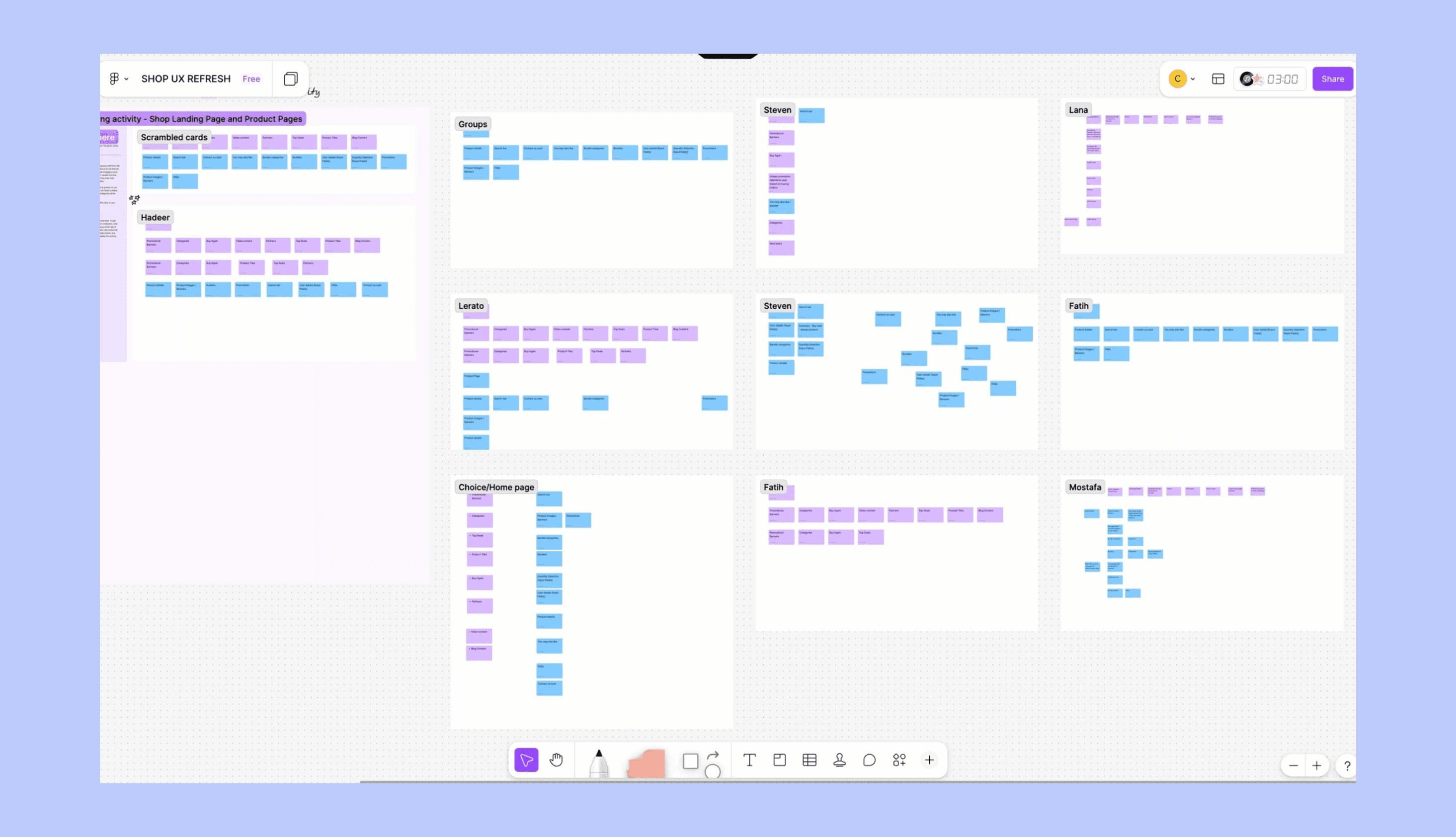
Research to Insights
From research and data, a few themes stood out:
Users wanted faster clarity: best deals, intent based categorization. We shifted from popularity-based discovery to intent-driven.
Navigation and categories didn’t match how users mentally grouped products; use–case–based categories helped users complete tasks faster.
Promos, cashbacks and rewards were present but invisible
Internal teams needed flexibility, not hard-coded layouts
Key design decision 1
Redesign focused on clarity, value props, and personalized discovery across markets, with improved product discovery, sorting, deal visibility, and region-specific personalization and signed-in experiences.
Impact: More users engaged from the first screen, reached product pages faster, and this contributed to a 42% increase in conversion rate and 3.2× growth in organic acquisition.


Key design decision 2
Stronger trust signals via social proof, value proposition strips, and clearer rewards messaging. Spotlight on the Carry1st Discount Points to increase usage.
Impact: Improved trust and repeat usage, contributing to record monthly active customers
Key design decision 3
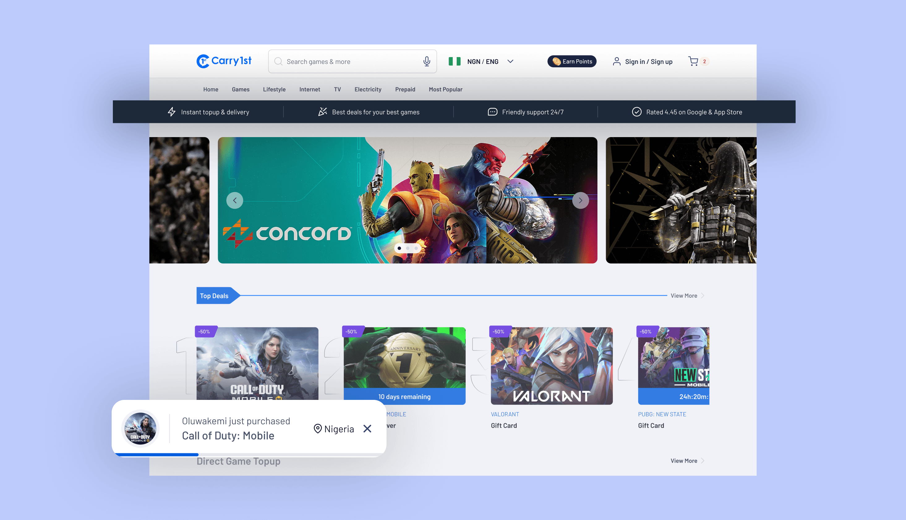
Making search visible and reliable: Many users didn’t know search existed. Those who found it said it didn’t work well or return useful results.
Impact: Search is now easy to find and works as expected, helping users quickly locate products, reducing frustration, and improving product discovery for high-intent users.


Key design decision 4
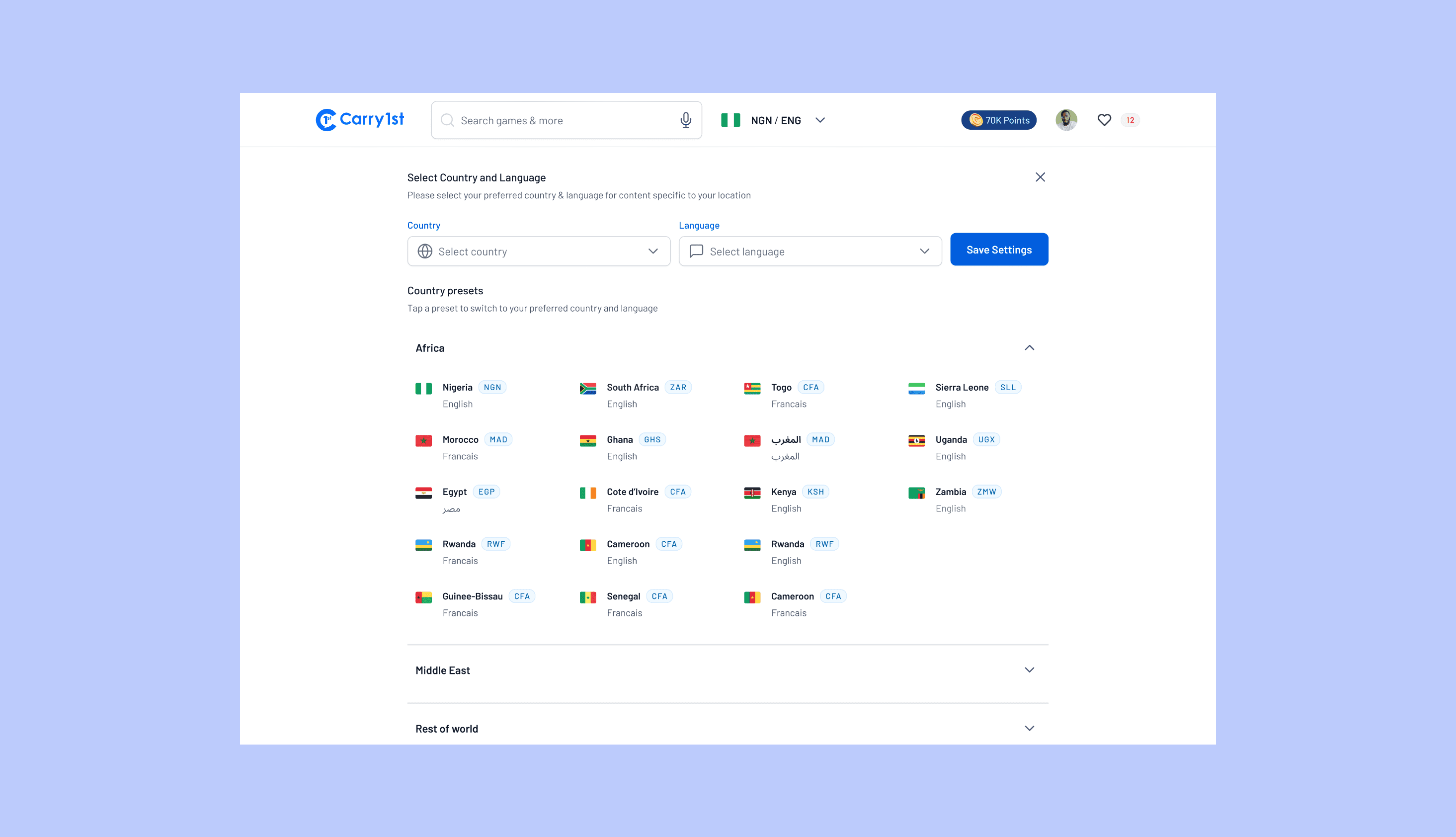
Country-based experience with upgraded country & language presets: MENA users were seeing irrelevant or unavailable products on first visit and had to manually filter to find what worked for them.
Impact: Users now land in the right country and language by default, enabling localized products, ads, deals, and payment methods improving early relevance and faster product discovery.


Tackling Consistency Platformwide
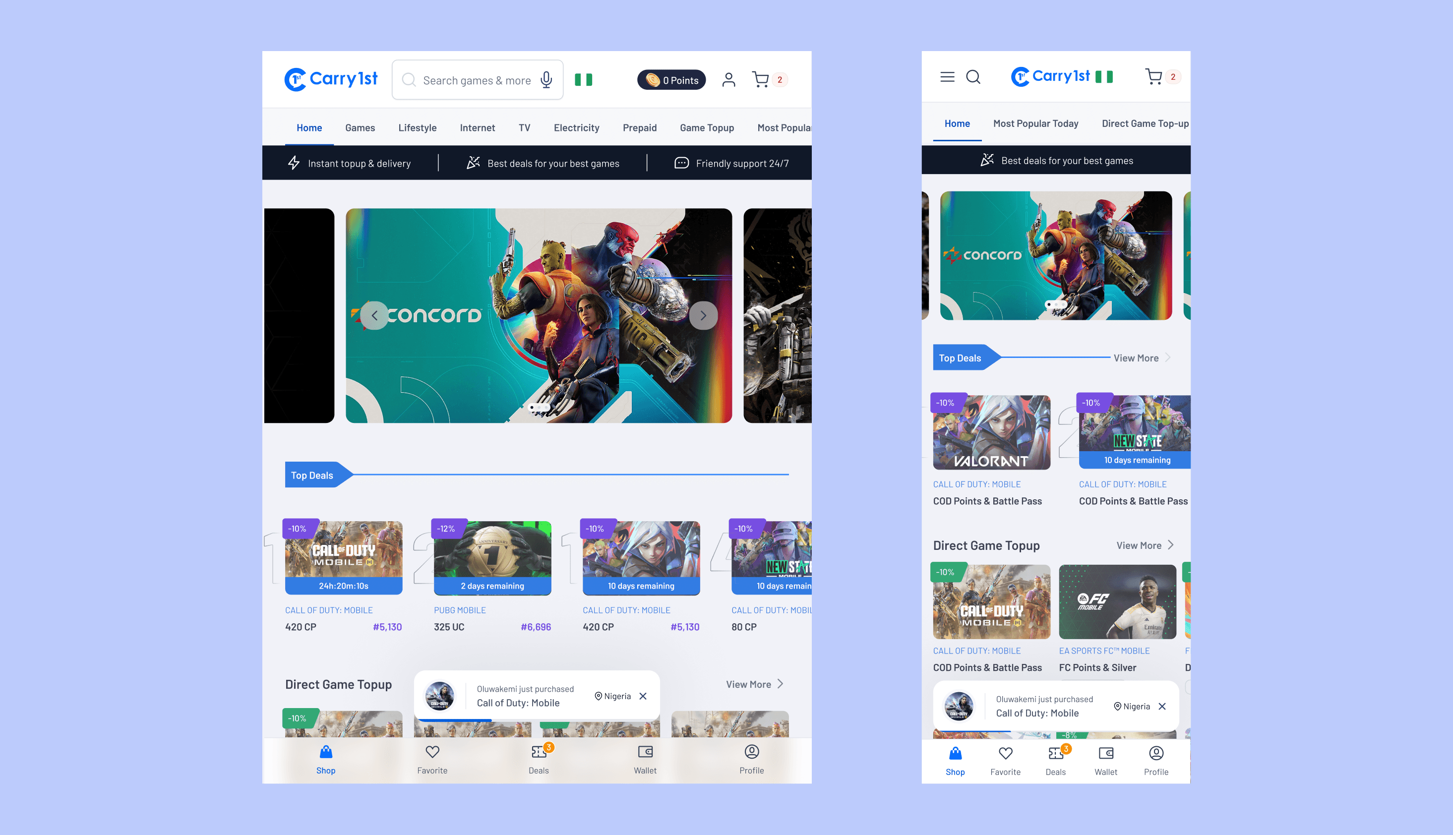
A refreshed design system (“1st of All Design System”) to unify everything.
This project drove significant evolution of the shared Figma component library. I built scalable marketplace card components, discovery grid patterns, and checkout flow components on a shared token structure; all reused across the platform products.
This reduced design debt across teams and enabled engineers to build new features without waiting for custom design specs.


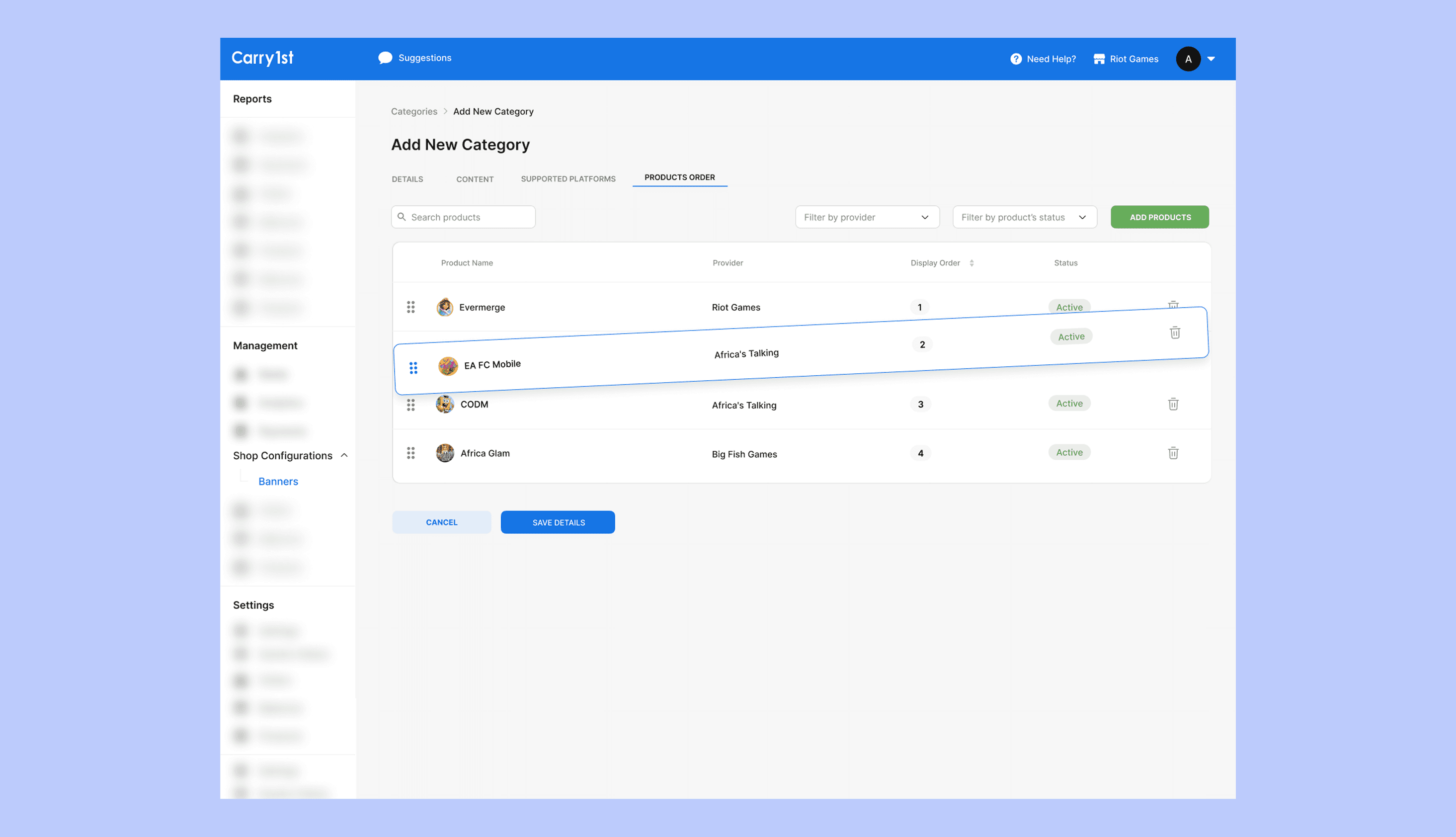
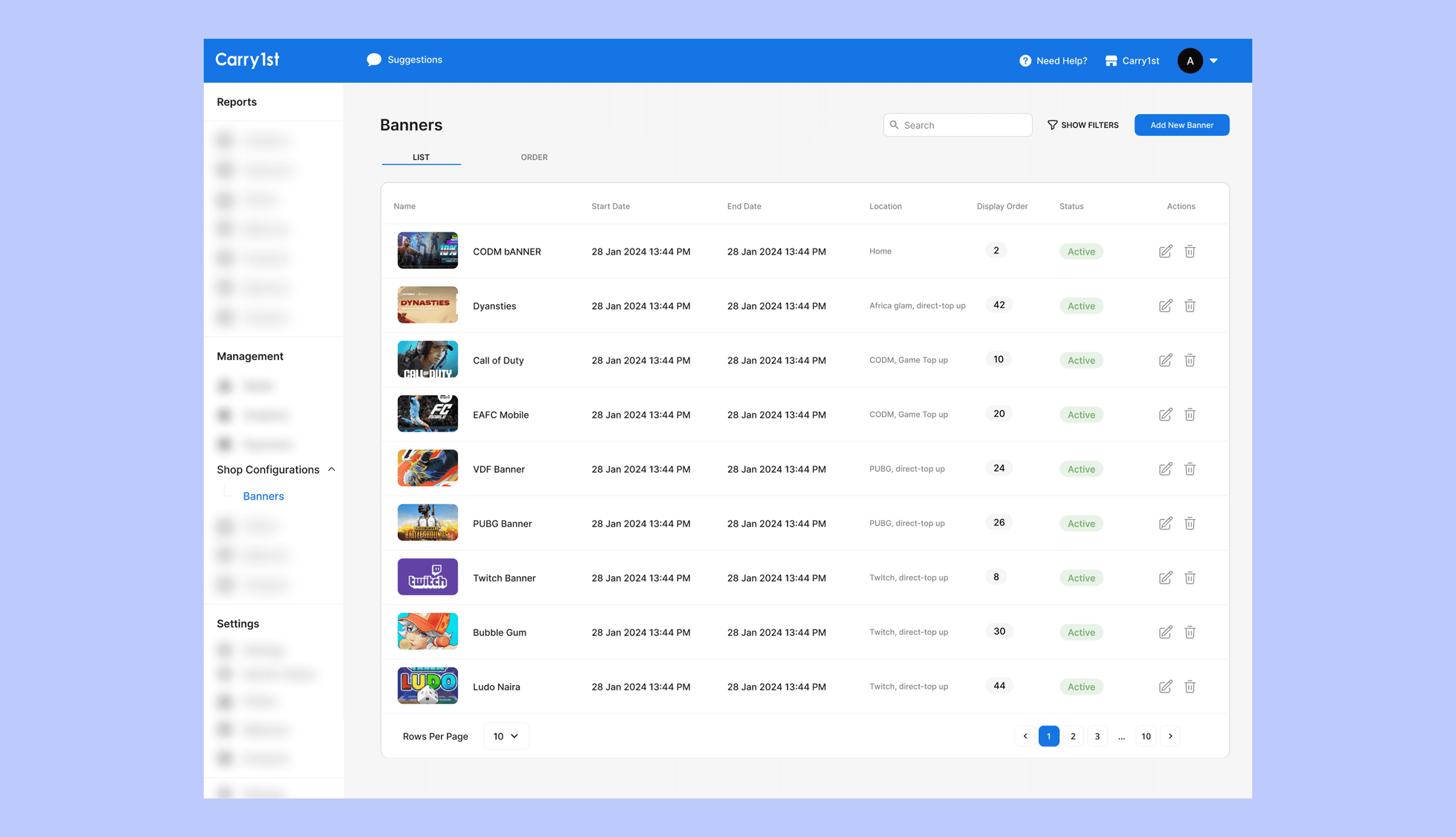
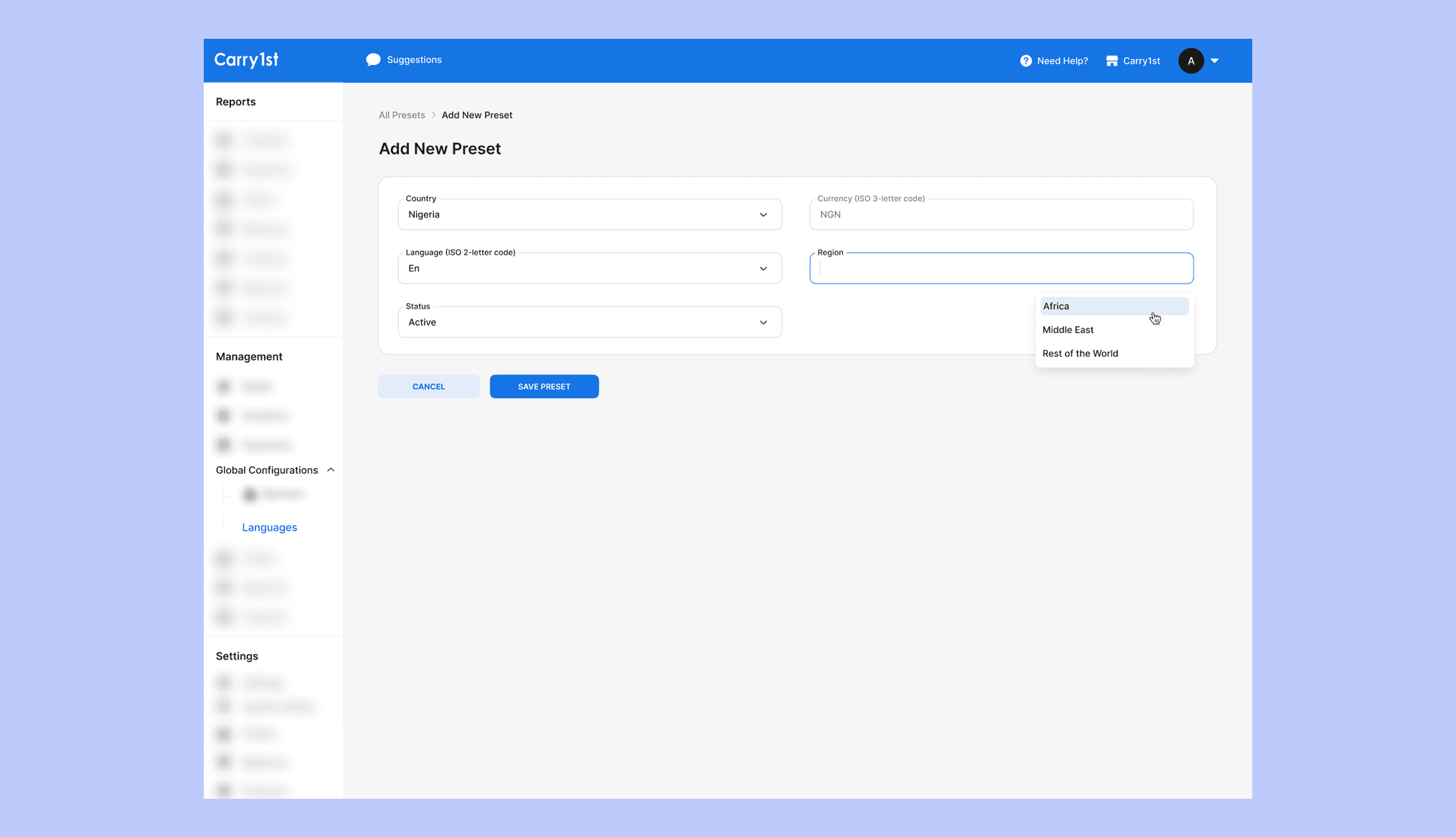
Admin Configurations UX (Very Critical)
I solely designed the admin experience so teams could:
Manage products, banners, categories, and top deals easily
Customize storefronts per region
Update content without engineering help


Leadership and Team Development
I mentored two junior designers through the research synthesis phase of this project, walking them through how to move from raw interview notes and Hotjar session data to prioritised design decisions.
This became part of how the team approached discovery on subsequent projects. I also led design critiques across multiple squads, helping align visual and interaction standards across marketplace, payments, and admin workstreams.
Takeaway
This project reinforced how powerful phased, research-driven design can be at scale. By grounding decisions in real user behaviour and enabling internal teams with better tools, design directly drove growth, trust, and operational speed.
4.4×
Monthly Active Customers Growth
58%
Increase in first-time purchase conversion
45%
Reduction in early-funnel drop-off
Resources that helped
Articulating Design Decisions

Don't Make me Think

Hooked

Measure What Matters


Mihail iliev
Lead PM
"Choice was awesome to work with. She jumped in on the Shop UX refresh, owned key parts end-to-end, made everything feel smoother for users and ops, and kept the whole team aligned and moving fast."
Arnoe de Vries
Lead Engineer
"Choice was a solid partner. She gave clear direction across the product work, collaborated closely with us on configs and implementation, and helped deliver a much cleaner, easier-to-manage experience overall."
Morakinyo Adejare
Lead Designer
"We collaborated tightly, worked hand-in-hand with engineering, and helped make the whole thing way more intuitive and effective for everyone. It was really nice working together."
Next Project

